Head of Branding
Graphic design and copywriting skill refined in professional setting, creating logos, documentation, and packaging.
Once our young enterprise team decided on a product (wooden educational toys, with an environmentally-friendly focus), we needed branding that reflected it.
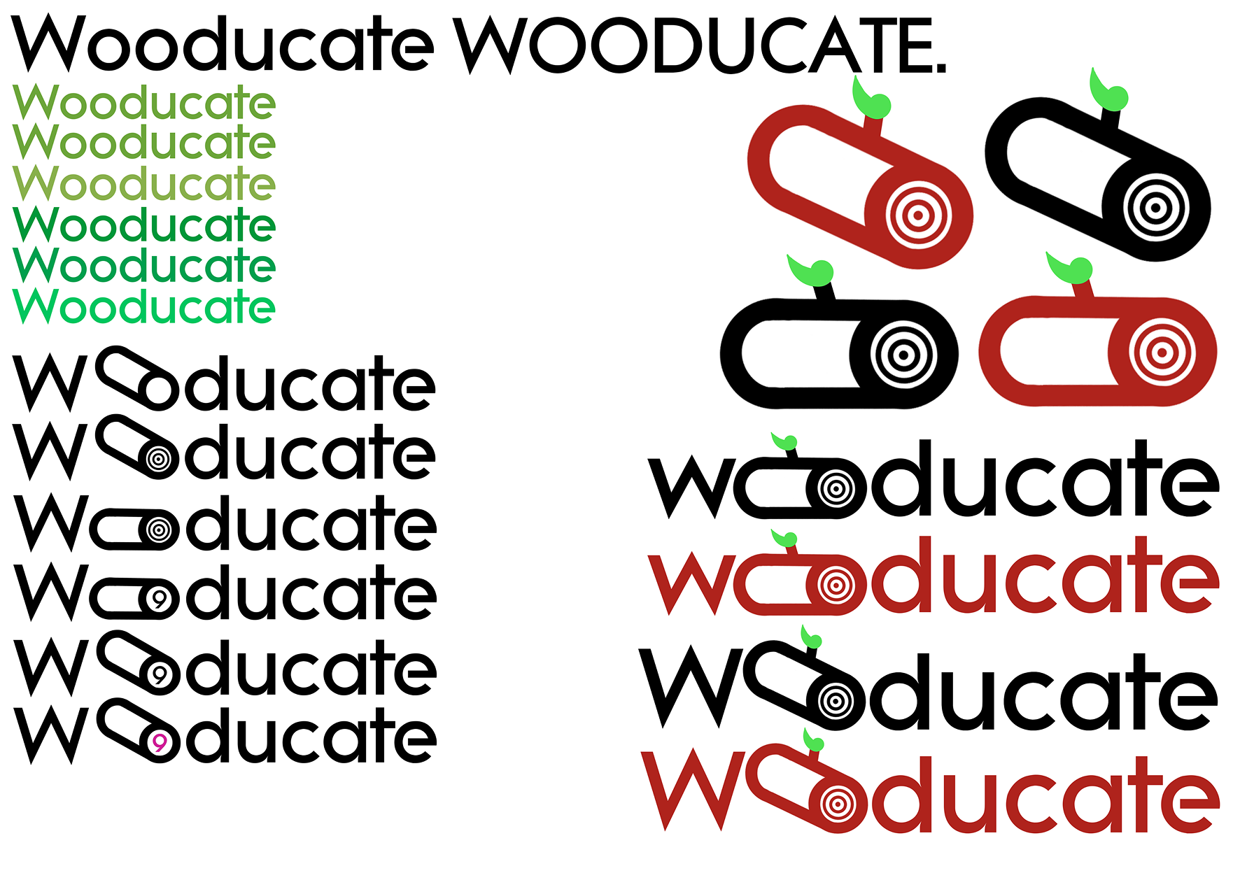
Ideation on the “Wooducate” logo. At this stage, the font beatnik SF had been chosen as it had understated lettering that conveyed an educational product, but with some flair such as a the open “e”, reflecting our exciting position as a student-led start-up.
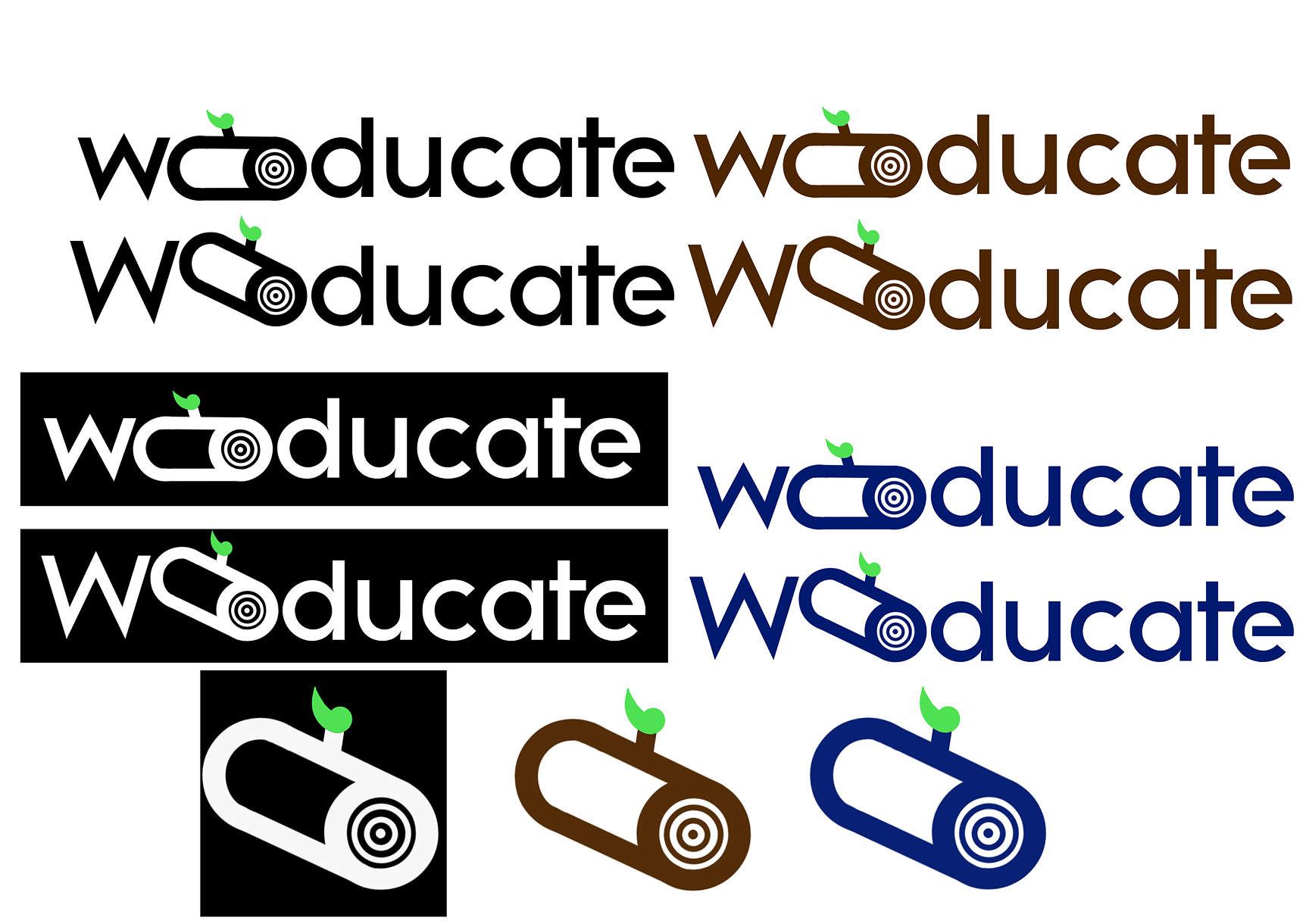
Finalising the logo, including addition of a leaf motif that can be reiterated throughout materials.
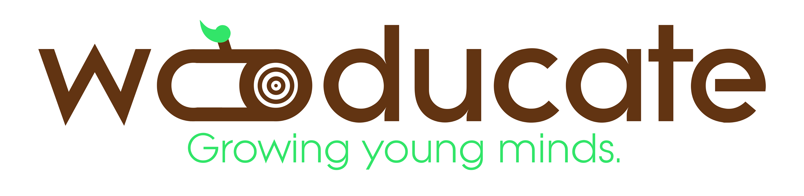
The final logo was democratically decided by the company, including my slogan “Growing young minds” which snappily encompasses education and our environmental (wooden) focus.
The manufacturing team then made the maths and literacy toys, but we needed packaging to present them to schools and parents in.
An initial draft for packaging, utilising the leaf motif.
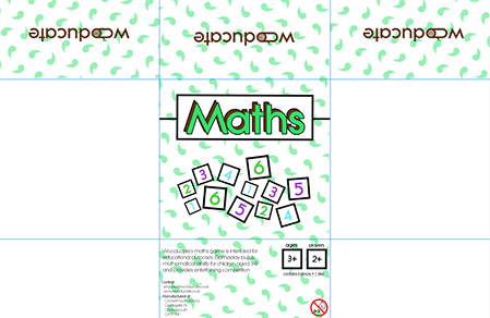

Finalised maths and literacy packaging to proper dimensions of boxes as specified by manufacturing team.
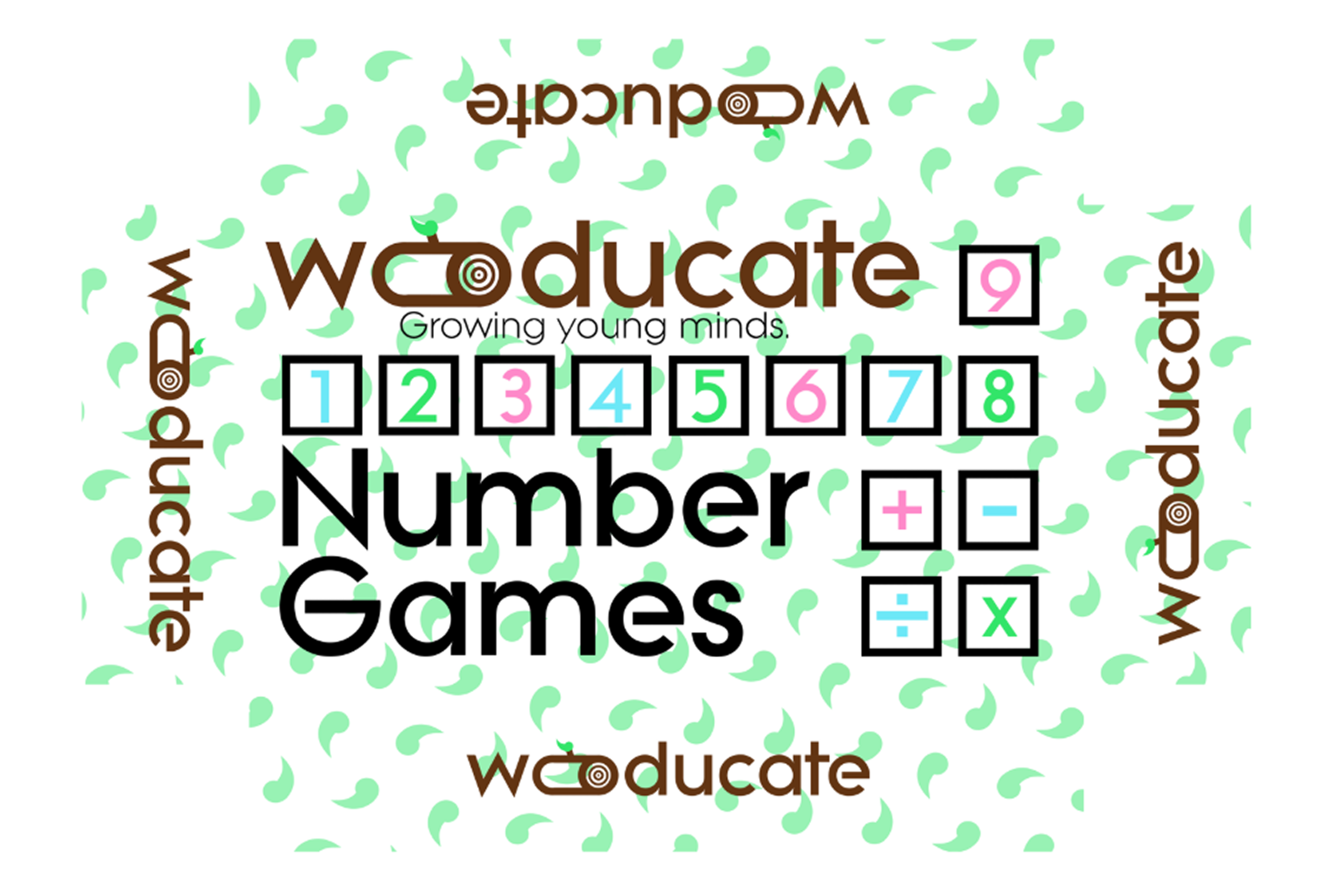
As well as this, the games needed instructions that were easily understandable for children using graphics, to fit within the packaging.
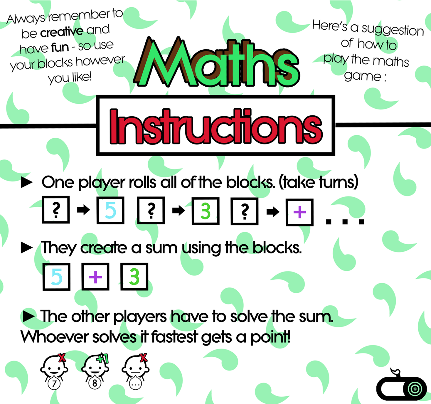
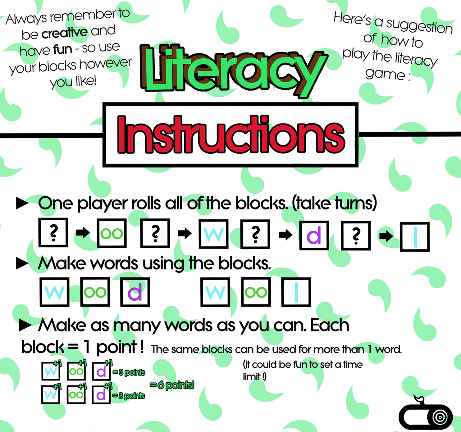
I was responsible for formulating the instructions for both games due to time pressure. They had to be simple but fun enough to engage children without being overtly educational.
Finally, we had to advertise our product.
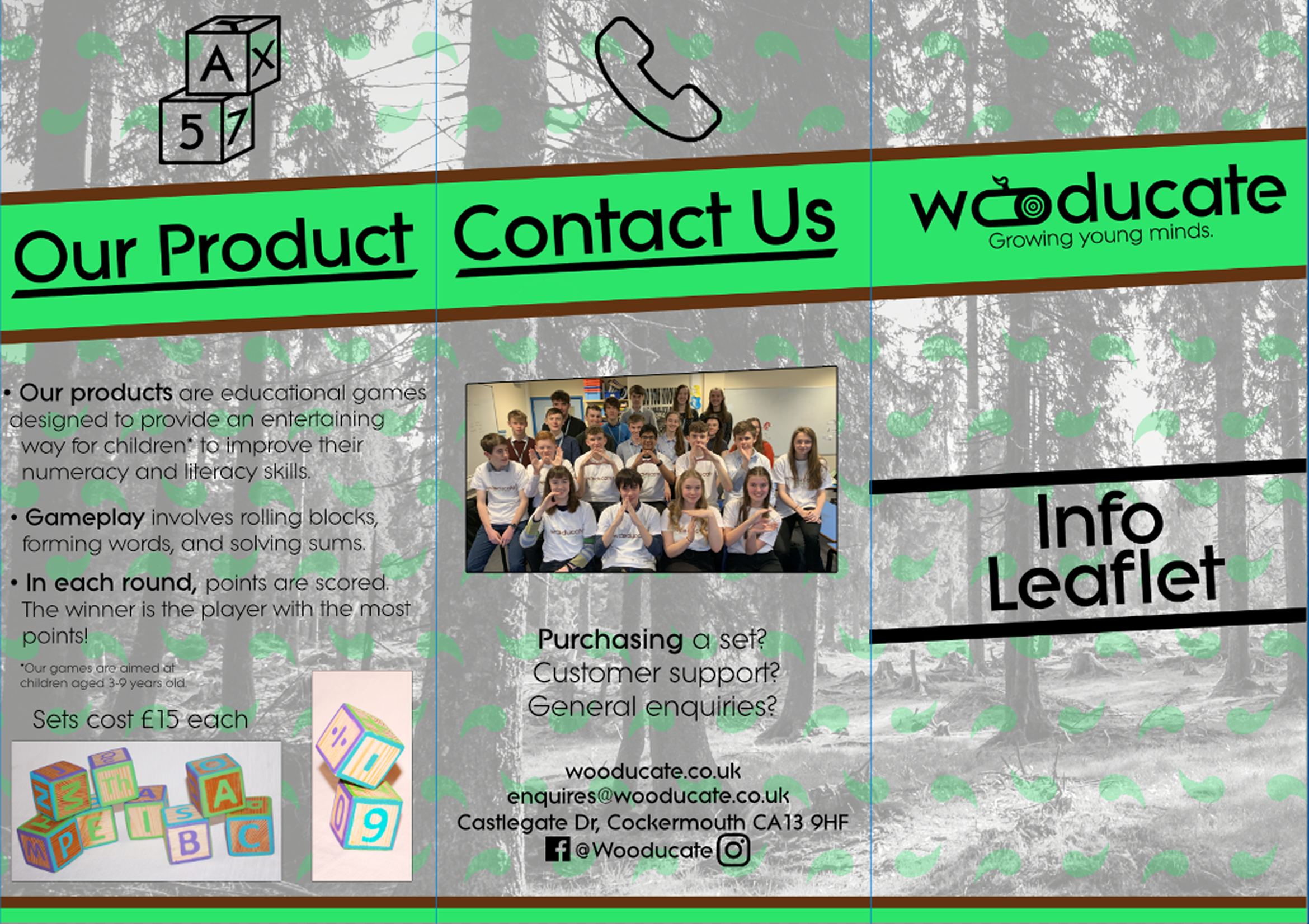
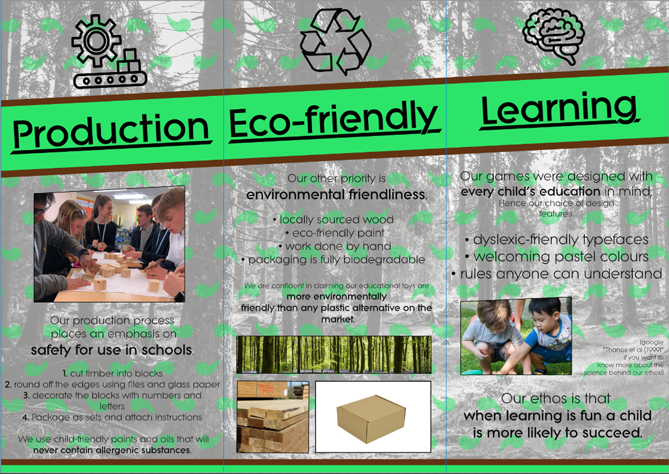
These leaflets were disseminated to local schools and aided in recruiting customers.
Overall, my role taught me about visual design in a commercial setting, particularly how clear communication is key within designs, where previously in my work the focus was on artistic expression. We were presented by Young Enterprise with the area runner-up for best marketing, of which the above was a key component.